...
- Make sure your ad appears in a spot that website visitors are likely to see.
Generally this means anything at the top of the page, especially the top center. - Use colors or graphics that draw the visitor’s eye.
For example, when we do banner ads across the top of website pages, we usually pick a saturated color that stands out from the other content.
~ss

You
We can also use an image to create visual interest. If we’re doing a prize draw (a common incentive), we’ll usually sometimes use an image of the prize (e.g. an Apple WatchiPad).
~ss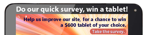
Once you have a visitor’s attention, you have a few seconds (at most) to convince them to participate. Like a roadside billboard, you are usually limited to the small amount of text that a “passer-by” is willing to skim.
We typically phrase the text as a simple value proposition: if you do Do this, and we’ll give you that. Here are some examples:
- ss
...
...
Do our 5-minute survey, get in the draw for an Apple Watch!
Help us make things easier to find - win a tablet!
You also need to make it clear what they should do next, if they decide to participate. This can be a clear text link (colored/underlined text) or a separate button.Finally, if
| Note |
|---|
| Note: If you are advertising your study on a website different from your own, you’ll need to add some context to your ad so that visitors are clear about what they’re volunteering for |
...
- ss
| . |
But it's not a survey, is it?
You may have wondered why we keep calling our study a "survey" in the examples above. ~~
Creating an explanation page
...