Once we get a score for a task, we naturally want to know why it scored like that:
- For high-scoring tasks, we want to know which parts of the tree were particularly effective in steering participants to the correct answers.
- For low-scoring tasks, we want to find out where participants went off the rails – which parts of the tree confused them or lured them down the wrong path.
A typical success
Let’s start with an example of a high-scoring task, because they are usually easier to analyze.
This one comes from InternetNZ, a non-profit Internet advocacy group in New Zealand. When they redesigned their website, they ran several tree tests to check the effectiveness of the new structure. Here’s a task that performed fairly well:
As we can see from the task summary, almost three quarters of our users found a correct answer, with very little backtracking. That’s good to know, but it’s not enough – we need to see where they went, both for the correct and the incorrect cases.
Most tools give you a way to examine the click paths for a given task. We used Treejack for this study, which offers a “pie tree” diagram showing where participants went:
For this example, let’s concentrate on the paths, not so much the pies themselves:
- The green paths are the right ones.
- The gray paths are the wrong ones.
- The thickness of the line shows how many people went that way.
The first thing we notice is how sparse the graph is – it only shows paths that participants actually took, and they didn’t take many different ones for this task.
When we run a tree test, this is what we want to see – a small number of paths taken, lots of traffic on the correct paths, and everyone clear on what everything means. The participants knew where they were going, and agreed on the same answers.
Note that there are two correct paths here. In the original tree, principles were only in the Policies section, but we saw most people go to About Us. So we put the Principles topic in both places. It would live in one place, and be explicitly cross-linked from the other. The same thing happened this time – most participants went to the About Us section, but this time there was a correct answer waiting for them.
Even the wrong answer is not so wrong here. You could feel pretty confident that users who went to an Our Mission page would get a partial answer for (and probably a link to) the organization’s principles.
Notice also that there was very little “leakage” at the top level (the first click from the home page). Only 1 participant out of 63 made a wrong turn at the start. We’ll discuss the importance of first clicks in more detail below.
A typical failure
But tree tests are not all sunshine and lollipops. Some of your tasks are more likely to look like this one, again from InternetNZ:
The correct answer in under Policies, in a section called Jurisdiction, but 86% of our participants failed to find it. But if only 3% gave up, where did all the others go?
The answer is that they went everywhere. Graphically, this is what “everywhere” looks like:
Quite a mess. But what can we learn from it?
If we look at the thickest paths first, we can see that most people did go to the Policies section (correct), and then mostly to the two correct areas (Projects by name, Projects by topic), but then they scattered. In those sections, they couldn’t agree which subtopic was the right one.
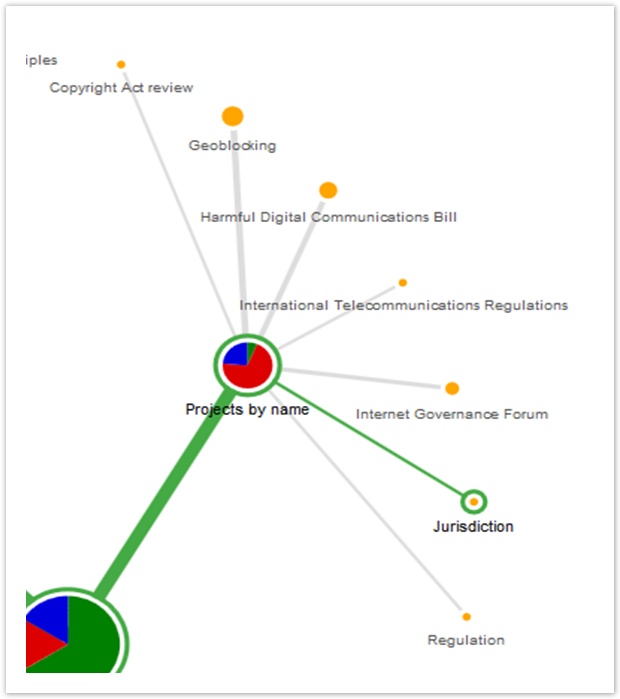
For example, let’s look at the Projects by name section more closely:
A large chunk of participants came here, and the correct answer (Jurisdiction) was waiting for them, but most didn’t choose it (partly because it’s more abstract than the other topics).
Not only did they not find the right answer, they couldn’t agree on the other topics either. The headings were not clear themselves, and they were hard to distinguish from each other.
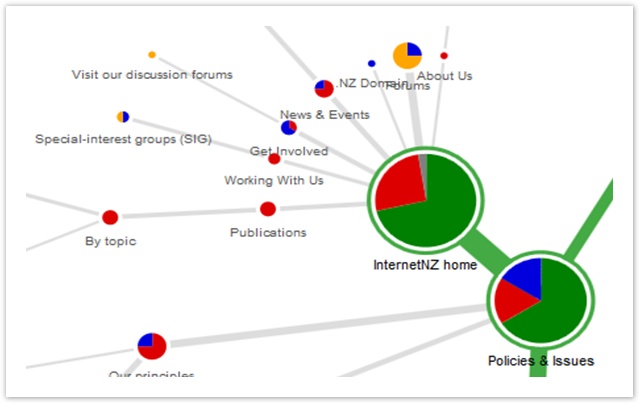
The graph makes another problem obvious too – the “leakage” at the top level of the tree:
Right at the start, as their first click, a large fraction of the participants ran off in all directions. This is not what we intend when we design a site structure. It suggests that either:
- Our top-level headings are not clear and distinguishable (which we should be able to confirm by looking for similar results in other tasks), or
- The task itself was not clear (probable if the top-level headings performed well in the other tasks)
You can also see scattering when you download the results as a spreadsheet. Here’s an example from Treejack, on the “Destination” sheet of its downloadable results:
- pic of spreadsheet showing vertical clustering
The vertical cluster of cells shows that, for a single task, participants chose a wide variety of subtopics under the correct topic.
Studying the click paths of a single task gives us insights into how the tree performed for that particular task. But it’s dangerous to draw conclusions based on only one scenario. What we need to do is look for supporting evidence from the other tasks in our study – see “Finding patterns among tasks” below.
- show examples from other tools (without pie trees)
Discovering more correct answers
Participants select wrong answers all the time. And most of the time, they really are wrong. Occasionally, though, they’re right, because we missed one.
It seems that no matter how thoughtfully we construct our trees and tasks up front, and mark which answers are correct, once we launch the test and start looking at click paths, we always seem to find more correct answers that participants have “discovered” on their own.
- example – Meridian tree 0 task 7 (get permission first)
Often, it’s clear that we missed an answer, so we should just fix it and recalculate our results – see “Updating correct answers” on page ~.
However, we do need to be careful about changing our correct answers based on incoming results, because adding correct answers will raise our scores. If we are analyzing a tree that we hope does well, it’s often a bit too easy to convince ourselves that our participants’ borderline answers should be marked as correct. For more on this, see “Pandering to the task” in Chapter 13.
The best way to govern this is to agree on some consistent criteria ahead of time - see “How Correct is Correct?”.
Next: What they clicked first


0 Comments