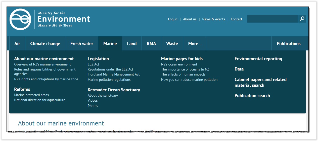
But most tree-testing tools insist on showing only one level of navigation at a time. How should we handle this in our tree test?
There are three common approaches that we’ve seen:
1) Show one level at a time – This ignores the previewing of subtopics and makes the user click through each level manually:
- Ministry for the Environment
- Air
- Climate change
- Fresh water
- Marine
- About our marine environment
- Overview of NZ's marine environment
- etc.
- Reforms
- etc.
- About our marine environment
- etc.
2) Combine levels using a prefix – The subtopics are brought up to the parent’s level, and the parent topic becomes their prefix:
- Ministry for the Environment
- etc.
- Marine - About our marine environment
- Overview of NZ's marine environment
- etc.
- Marine - Reforms
- Marine - etc.
- Land - etc.
3) Indent using spacer characters – Subtopics are moved up to the parent level, but they are moved to the right to look like they are under the parent topic. In the example below, underscores show the spaces.
- Ministry for the Environment
- Air
- Climate change
- Fresh water
- Marine
- __About our marine environment
- Overview of NZ's marine environment
- etc.
- __Reforms
- __etc.
While all three methods work, we generally go with method 1. While it is less “realistic” than the others (in terms of visual presentation), it does test the clarity of each topic separately. Ideally, parent topics should be clear and distinguishable on their own, even without previewing their subtopics.