| Table of Contents | ||
|---|---|---|
|
...
In our experience, there are two basic ways that designers approach the creation of a website:
...
To illustrate this, let’s imagine two designers, Tom and Maria, who are creating both asked to design a medium-size content websites website for cycling – say about 300 pages of well-designed, clearly written information.
...
Having studied the content and talked to the site’s internal stakeholders, Tom thinks a lot, then opens a new spreadsheet and creates a text tree of possible headings and subheadings, based on the various types of activities that the site offers.
...
A day or two later, another idea occurs to him, so he creates another tree based on different types of audiences:
...
He adds a few questions here and there where he needs to check ideas and terminology with the other project members.
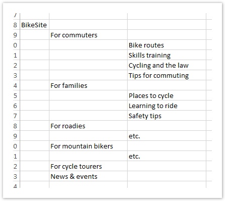
When he reviews his structural tree ideas with others on the team, they make most of them like the audience-based scheme. They make some comments and suggestions, and he accordingly makes a few revisions . Most of them prefer the audience-based tree, which he is also leaning towards, so he goes with that design for the actual websitebefore delivering the design.
Everyone is happy until several weeks after the site is released. The analytics show that certain parts of the site that expected heavy traffic are getting very little, while the web-feedback channel is choked with users complaining they can’t find this or that on the new site. (They love the new look and feel, but it’s much harder to find things now that everything has changed.) This feedback persists for several months.
...
"Way too much work to find what I want. Maps used to be all in one place, but now they're scattered all over the place." - a disgruntled site visitor
Eventually, a consultant is brought in to do some usability testing on the site and recommend fixes. One of the major issues she finds is that the site is organized in a way that makes sense to the project team, but not to one some of their two major audiences. Some of this can be fixed with simple terminology changes, but some of it will require fundamental changes to the site structure, which will in turn require a good deal of content rework.
No one (including Tom) wanted this result, but now that they know about it, it can be fixed in release 2 . New features will have to wait until later, (if they can get funding .
- quote from project manager about having to redesign navigation in v2
...
for it).
"We were hoping to add a stolen-bike registry next, but that will have to wait until we solve some basic navigation issues." - site owner
Maria and the empirical method
Like Tom, Maria starts by studying the content and talking to the site’s internal stakeholders. And, like Tom, her initial instinct is an audience-based scheme.
She also asks about any existing user research, and receives the results of a site survey done the previous year, which suggests some new content but doesn't give any clues to better ways to organize the site.
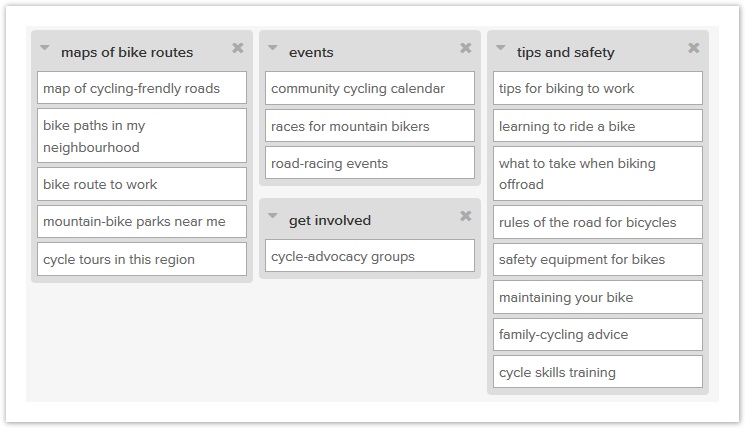
She has some ideas on how to structure the content, but she also knows that she is not the target audience, so she decides that she needs to get some user input to help generate structure ideas. She runs an open card sort online using some representative content, and discovers that most users actually organize the cards according to activity, not according to audience. Her initial hunch was wrong, but it’s easy to change direction this early in the game.
...
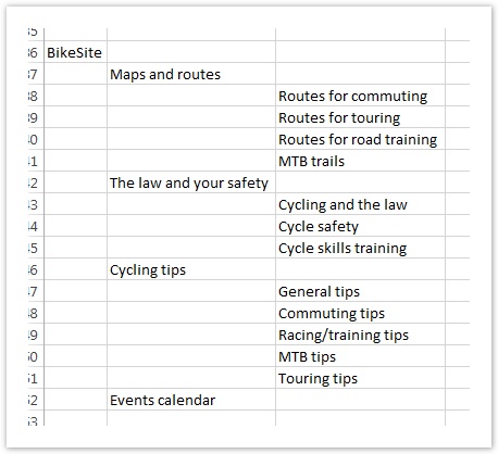
She then opens a new spreadsheet and creates a text tree of possible headings and subheadings, based on the various types of activities topics that the site offers. (Tom also did this.)
She then creates a second tree that is also activities-based, but uses a different organizing method for the next level down (based on another finding she picked up from the card sort).
...
Like Tom, Maria checks her ideas with the project team and revises some terminology accordingly. Most of her team prefers her first tree to her second, which confirms her own preference.
:
Instead of finalizing the structure then and there, she wants some proof that the first tree is the best, and to see if anything else needs revising from a user’s point of view. She takes a week to run a topic-based tree is better than her initial idea of an audience-based tree. So she creates an audience-based tree as well, and decides to test them against each other. (The project sponsor happens to prefer the audience scheme, so this is an additional reason to get objective data on both before deciding.)
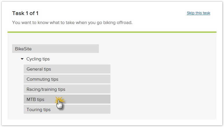
Maria spends a week running side-by-side two tree tests (one for each tree), and gets about 100 people to try out both each tree ideas:
...
The results are revealing – the second topic-based tree actually performs much better, except for a few tasks where the first audience-based tree wins:
...
| Metric | Topic tree | Audience tree |
|---|---|---|
| Success rate | 72% | 55% |
| Directness | 77% | 64% |
| Average speed | 14 secs | 18 secs |
Maria reviews the results of the test with the team, and they agree to go with the second topic tree, but incorporating some elements of the first audience tree that worked particularly well. This is the structure they build the site with, and when they run a usability test on the alpha version, it performs well except for a few minor changes that they can make before the site is released.
...
Once the site is live, the analytics show the expected areas of traffic. A few users complain about not being able to find things because they’ve been moved, but these complaints dwindle after the first month as users become familiar with the new structure.
"Took a bit to get used to, but it's now much easier to find what I want." - a satisfied site visitor
Maria, her project team, and upper management are all happy with the new site, so they find it easy to get funding to do the exciting things they have in mind for release 2.
- quote from project manager about the cool stuff they can now do in v2
...
:
"Great feedback from users, and traffic has jumped too. The committee was happy to give us the go-ahead for the new stuff in release 2." - site owner
The moral of our story
In our experience, Don't dismiss this is a straw-man example; over the years we've seen an astonishing number of websites are created using Tom’s single-design genius method (or something very close to it). The Toms of the design world may be talented, but they are often curiously reluctant to use empirical tools to test their designs before the website ships. And the odds of them getting everything right the first time are very low. That translates into a high risk for the organization.
Geniuses do have great ideas (that’s why they’re geniuses) but they also tend to think that all their ideas are good. Geniuses are also hard to find, sometimes hard to work with, and usually expensive. And they don’t usually come with guarantees.
On the other hand, designers like Maria who use empirical tools to improve their work lower the risk of delivering a poor experience for mistakes to users. By testing their ideas before the website is finished (or even before it’s started), they can see what works and what doesn’t for the site’s intended audiences. Instead of doing “genius design”, they’re doing “user-centered” design.
It doesn’t take a genius We don't have to be geniuses to recommend the latter approach. ![]()
...
Next: Good IA starts with an effective site tree