...
Besides organization, the other IA element we're concentrating that tree tests focus on is labelling - the specific words we use in our headings.
When we run a tree test, we are seeing the interaction of these two factors:
| Organization | If a user can't navigate down to the right heading, it doesn't matter how hard we worked to make that heading clear. |
|---|---|
| Labelling | If a user doesn't understand a certain heading, they're unlikely to click on it to see its subheadings |
Some labels are dead easy to create, while others seem to get harder the more we tinker with them. What is it that makes one label better than another?
Below are some principles and tips to help you create effective headings.
...
- If we're new to this bus company, we probably don't know the different between Flexi-Pass and TravelPass, so we would have to visit both pages to find out.
- However, if we're regular customers, we are probably familiar with these terms, so navigation is easy.
If youwe're not sure which terms your our audience uses, there are several ways to find out:
- If you we run an open card sort to generate ideas for your our site tree, pay attention to we can examine the headings that your our participants create.
- If you we do contextual inquiry or other qualitative research with your users, we can review your our notes or recordings for verbatim terms that they use.
- Check your our search logs to see what your our site visitors are typing into the search box.
This has the double value of showing what your users couldn't our users may not have been able to find by browsing, and what words they use during navigation.
...
...but tree testing and usability testing showed that other audiences (such as businesses) also considered themselves to be "providers", causing some hesitation in choosing the right section.
Changing this label to "Medical Providers" solves that problem, but introduces another, because "Medical Providers" might be interpreted by patients as offering a list of medical providers to contact.
Using a term like "For Medical Providers" is unambiguousclearer, but alas, this may be too long for the space available - see Balance brevity with clarity below.
...
...now it becomes much harder to decide where to go if you we have questions.
- e.g. bus website or Telstra "at home" vs. "homeplan"
...
Use specific, concrete terms
- example from MoE or MfE, or "personal" from consumer.org.nz
...
Make headings scannable
- i.e. front-loading phrases (see Nielsen article - same idea as for links)
...
Use specific, concrete terms
We should be as specific as possible when writing a heading. This helps prevents misunderstanding, and makes headings more distinguishable from each other (see above).
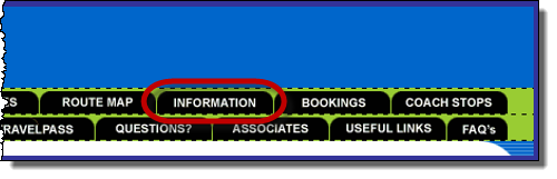
For example, the bus website mentioned above has an Information tab. If we asked 5 different people what that tab contained, we would likely get 5 different answers:
Writing a vague heading can also create an evil attractor - a link that lures clicks when we don't want it to.
In Discovering evil attractors in Chapter 12, we see that a consumer-review website tried a Personal subheading in their Appliance section. In tree testing, participants mistakenly chose it as the answer for a wide variety of unrelated tasks. When they made it more specific (changing Personal to Persona Care), the problem went away.
Make headings quick to skim
It also helps to make headings easy to skim, by putting the most important differentiating words up front.
For example, this list of headings is typical, but not very scannable:
- Using your debit card
- How to apply for a credit card
- Understanding credit-card limits
- How you can budget for credit cards
Usability guru Jakob Nielsen calls this "Starting with blah-blah and deferring the information-carrying text to the end".
We can easily make this list more scannable by front-loading the headings, like this:
- Debit cards - how to use
- Credit cards - apply online
- Credit-card limits - how they work
- Budgeting for credit cards
For more on front-loading headings and links, see Nielsen's oft-cited article.
Anchor brevity brevity
Balance brevity with clarity
| brevity | |
| brevity |
One conundrum that we encounter when writing headings is the tug of war between:
- brevity (these headings may need to fit in a column or along a nav bar), and
- clarity (it's usually easier to be specific and unambiguous if we can add a few extra qualifying words)
...
Combine entangled topics
- (e.g. foobar & bleem)
...
For more on this, check out ~web or book linkThere's no magic answer here. Some headings are very clear using a single short word (e.g. Clearance in a shopping site), while others require a lengthier phrase (e.g. For Medical Providers in a healthcare site), and may still not be as clear as we would like.
When writing headings that will be space-constrained (such as the headings in a horizontal nav bar), it's a good idea to lay them out roughly before we tree-test them. The layout can be quick and dirty, using paper and pen, or a mock layout in a drawing app like PowerPoint. We can then determine if we need to shorten the headings. This prevents us from tree-testing a verbose tree and later having to trim it down for the actual website, because shortening our carefully crafted headings is likely to change their effectiveness.
Combine entangled topics
We sometimes encounter two topics that are intertwined, to the extent that it doesn't make sense to separate them, but it's also hard to think of an overall word for them.
For example, a city-council website may have content about city parks, sports fields, and play areas, that they want to put in a single section of the site:
- Parks by itself may not be general enough to grab people who want to know about sports.
- Recreation may not be where people look for bike-commuter trails.
- There may not be an obvious word that covers both of these.
- The solution, of course, has now become commonplace - Parks & Recreation.
This tactic - taking the best descriptors of each topic and combining them - can be a very effective way of combining overlapping content without having to "invent" some abstract word that hurts findability.
Consider an organization that publishes position papers and monthly bulletins. They want to combine these in a single section, but what to call this section?
- Resources is a common solution, but usually a poor one, because it means too many things to too many people, and is likely to become an evil attractor.
- Publications is better, but is still a bit vague, and may not be a likely target for those looking for news articles (which are published in their bulletins).
- Papers & Bulletins, while longer-winded, actually tests better than the others, because it's specific about the two major types of content in that section.
...
Next: Team-sourcing ideas