...
- Site visitors may not know what the brand name means.
"I have no idea what LUCAS is." (a university admin system)
For more on heading clarity, see below. - They know what they want, but not its brand name.
"Where's the portal login?" (hidden behind a Keeping Connected link) - Brand names may be hard to distinguish from each other.
"What's the difference between the At Home package and HomePlan?"
For more on distinguishable headings, see below.
Make headings
...
When we "speak the user's language" (see above), we are ensuring that we're using words that our users understand.
...
unambiguous
In addition to being understandable, effective headings are also unambiguous - users should not be asking which of several meanings might apply.
- example
...
For example, this healthcare site has a section for medical professionals, which they label Providers...
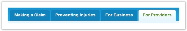
...but tree testing and usability testing showed that other audiences (such as businesses) also considered themselves to be "providers", causing some hesitation in choosing the right section.
Changing this label to "Medical Providers" solves that problem, but introduces another, because "Medical Providers" might be interpreted by patients as offering a list of medical providers to contact.
Using a term like "For Medical Providers" is unambiguous, but may be too long for the space available - see Balance brevity with clarity below.
Make headings distinguishable
...
- i.e. front-loading phrases (see Nielsen article - same idea as for links)
Anchor brevity brevity
Balance brevity with clarity
| brevity | |
| brevity |
-
need content
Combine entangled topics
...