Besides organization, the other IA element we're concentrating on is labelling - the specific words we use in our headings.
When we run a tree test, we are seeing the interaction of these two factors:
| Organization | If a user can't navigate down to the right heading, it doesn't matter how hard we worked to make that heading clear. |
|---|---|
| Labelling | If a user doesn't understand a certain heading, they're unlikely to click on it to see its subheadings |
Some labels are dead easy to create, while others seem to get harder the more we tinker with them. What is it that makes one label better than another?
Below are some principles and tips to help you create effective headings.
Speak the user's language
The most important thing we can do when phrasing headings (and content in general) is to use the same terms that our audience uses themselves.
For example, if we create a section called Contingency planning, and our audience generally has a high-school education, we should replace it with a more understandable term like Emergencies.
Note that "speaking the user's language" is not the same thing as the common advice to "avoid jargon". If our audience regularly uses jargon themselves (for example, programmers who are comfortable with terms like AJAX and hypervisor), then we should consider using those terms in our headings and our content. While jargon is often opaque for outsiders, it is efficient and precise for insiders.
Consider the following example from a bus website:
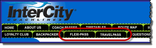
- If we're new to this bus company, we probably don't know the different between Flexi-Pass and TravelPass, so we would have to visit both pages to find out.
- However, if we're regular customers, we are probably familiar with these terms, so navigation is easy.
If you're not sure which terms your audience uses, there are several ways to find out:
- If you run an open card sort to generate ideas for your site tree, pay attention to the headings that your participants create.
- If you do contextual inquiry or other qualitative research with your users, review your notes or recordings for verbatim terms that they use.
- Check your search logs to see what your site visitors are typing into the search box.
This has the double value of showing what your users couldn't find by browsing, and what words they use during navigation.
Be wary of brand names
Organizations love to come up with catchy or cute names for their products or services. And this is not limited to commercial products; government agencies also have a long history of creating programmes with catchy "marketing-speak" names, such as StudyLink (for student loans) and Keeping Connected (a transport portal).
The problem here is that while the organization knows what these labels mean, it often assumes (wrongly) that its users know too.
Brand names used by themselves in headings can cause the following issues:
- Site visitors may not know what the brand name means.
"I have no idea what LUCAS is." (a university admin system)
For more on heading clarity, see below. - They know what they want, but not its brand name.
"Where's the portal login?" (hidden behind a Keeping Connected link) - Brand names may be hard to distinguish from each other.
"What's the difference between the At Home package and HomePlan?"
For more on distinguishable headings, see below.
Make headings unambiguous
In addition to being understandable, effective headings are also unambiguous - users should not be asking which of several meanings might apply.
For example, this healthcare site has a section for medical professionals, which they label Providers...
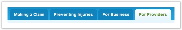
...but tree testing and usability testing showed that other audiences (such as businesses) also considered themselves to be "providers", causing some hesitation in choosing the right section.
Changing this label to "Medical Providers" solves that problem, but introduces another, because "Medical Providers" might be interpreted by patients as offering a list of medical providers to contact.
Using a term like "For Medical Providers" is unambiguous, but may be too long for the space available - see Balance brevity with clarity below.
Make headings distinguishable
Users typically encounter several headings at a time, and need to be able to successfully choose between them.
That's why it's critical that we make our headings easily distinguishable from each other.
For example, if we have a FAQ heading, most audiences will know that it leads to a page of frequently asked questions. By itself, it's a clear heading. If, however, we group it with other headings like those shown below...
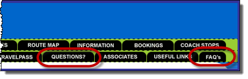
...now it becomes much harder to decide where to go if you have questions.
Use specific, concrete terms
We should be as specific as possible when writing a heading. This helps prevents misunderstanding, and makes headings more distinguishable from each other (see above).
For example,
- example from MoE or MfE, or "personal" from consumer.org.nz
Make headings scannable
- i.e. front-loading phrases (see Nielsen article - same idea as for links)
Balance brevity with clarity
need content
Combine entangled topics
- (e.g. foobar & bleem)
For more on this, check out ~web or book link.
Next: Team-sourcing ideas